
Overlay GSC Data with Google Algo Updates Using Python
Most SEO’s hearts skip a beat when they hear a Google algorithm update is unfolding and for a few days relentlessly check analytics. Then, there is a natural lull, the panic or excitement fades and you get back to your work. Google algorithms don’t always result in a dramatic spike one way or another. It can take weeks to determine a trend or a cause. In this tutorial, I’ll show you how to overlay your GSC data with known Google algorithm updates so you can better see a possible cause and effect.
The inspiration for this app and tutorial go to Signor Colt at iPullRank Agency for his most excellent data overlaying guide here. I wanted to try and put my own spin on this with this very specific application in mind.
Not interested in the tutorial? Head straight for the app here. The app gives you the ability to graph all 4 performance metrics.
Looking for a non-python professional option? Check out Seotesting’s Algorithm Update tool.
Table of Contents
Requirements and Assumptions
- Python 3 is installed and basic Python syntax understood
- Access to a Linux installation (I recommend Ubuntu) or Google Colab.
- GSC date performance data
Import Python Modules
- json: for parsing the google algo list
- requests: to request the google algo list
- pandas: to import the GSC data
- matplotlib: for plotting/graphing
- figure: support for plotting/graphing
- datetime: to format date strings into date objects
- numpy: to help format the dates x-axis in the graphs
Let’s start the script off by importing those modules into the script.
import json
import requests
import pandas as pd
import matplotlib.pyplot as plt
from matplotlib.pyplot import figure
from datetime import datetime
import numpy as np
The first thing we’ll do is grab the algo list in JSON form available thanks to iPullRank. I am unsure if this list will be updated going forward. I may look to develop something if not. We then load the JSON data into updates_dict. I’m going to create 3 lists for each component of the algorithm (date, title, source), but I suppose you could create a 3 element list of lists. The data is then loaded into each list for use later on.
updates = requests.get("https://ipullrank-dev.github.io/algo-worker/")
updates_dict = json.loads(updates.text)

google_dates =[]
algo_notes = []
title = []

for x in updates_dict:
  google_dates.append(x['date'])
  algo_notes.append(x['title'])
  title.append(x['source'])
Next, we import the GSC data. When exporting performance data you’ll be given a zip file. In the zip file you want the Dates.csv file. Then we need to convert the date from a string to a datetime object so we can next format it like the date in the Google Algo JSON data. Lastly, we sort the date values ascending so they are in oldest to newest for the graph.
gsc = pd.read_csv("Dates.csv")
gsc['Date'] = gsc['Date'].astype('datetime64[ns]')
gsc['Date'] = gsc["Date"].dt.strftime('%-m/%d/%Y')
gsc = gsc.sort_values('Date',ascending=True)
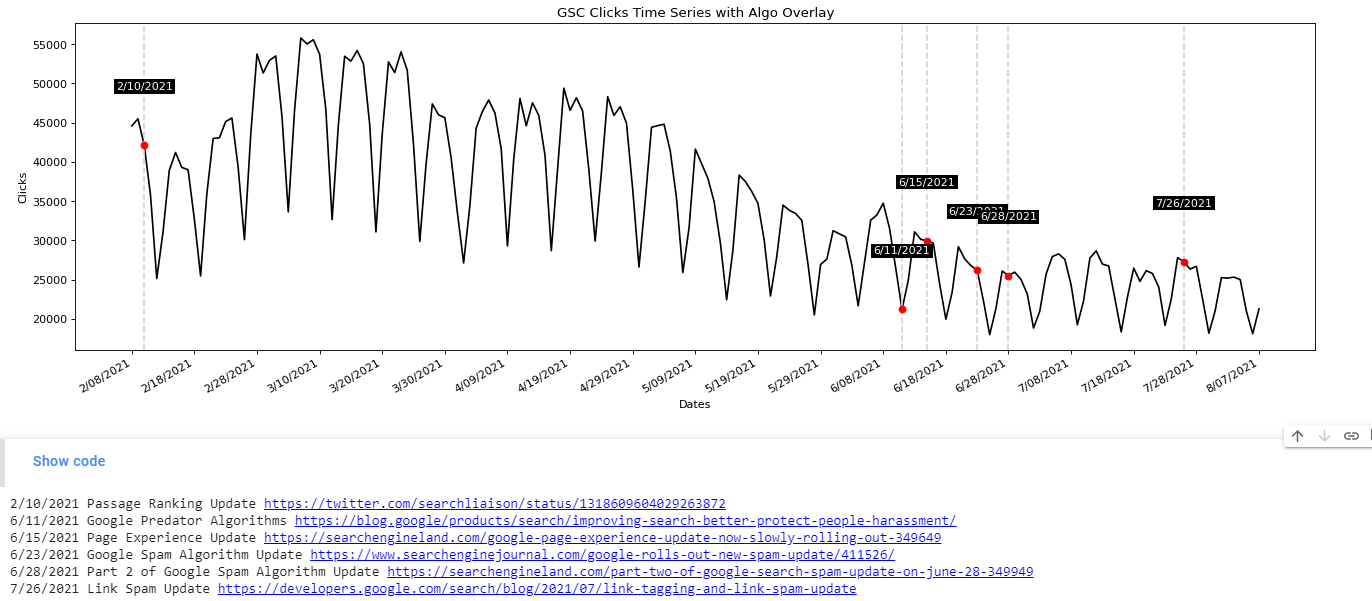
Now it’s time to start graphing! First, we set our axis data. GSC date will be the primary Y-Axis, GSC Clicks the primary X-Axis, and the Algo Dates a secondary Y-Axis. After setting some basics axis labels, we initialize the size of the graph with figure(). We use the plot() function to write the initial data plot points. The last parameter is color and line style. You can see a color guide here and a line type guide here. Lastly, we run the function autofmt_xdate() which automatically formats the date labels to fit the graph size.
xs = gsc['Date']
xss = google_dates
ys = gsc['Clicks']

plt.title("GSC Clicks Time Series with Algo Overlay")
plt.xlabel("Dates")
plt.ylabel("Clicks")
figure(figsize=(20, 6), dpi=80)
plt.plot(xs,ys,'k-')
plt.gcf().autofmt_xdate()

algo_list = []
The last graph part is to loop over each coordinate in the above initial graph and detect if a GSC date matches a date we have for a Google algo update.
If there is a match:
- Append the information to a new list where we will print out the details after graphing.
- Create a vertical grey dashed line at the position where the dates match
- Plot a red dot at the point where the dates match
- Create a text annotation at the point where they match that highlights the date where the algo matches a GSC date
Lastly, we handle pacing out the dates along the Y-Axis. If you have more than 30 days’ worth of data, the dates are going to be smashed together. We use the numpy function arrange() to calculate a range of dates from 0 to # of total dates uploaded, jumping by 10. We then shave off even more by altering the ticks to display every 10th date. This results in easy reading for a year or 6 months. If you are using 16 months I’d increase the jump number.
for x,y in zip(xs,ys):

  label = x

  if x in google_dates:
    algo_list.append(x)
    plt.axvline(x=x, color="lightgray", linestyle="--")
    plt.plot(x,y,'ro')

    plt.annotate(label,
                 (x,y),
                 color='white',
                 textcoords="offset points",
                 xytext=(0,50),
                 ha='center',
                 bbox=dict(boxstyle='square,pad=.2', fc='k', ec='none'))

ind = np.arange(0, len(xs.index), 10)
plt.xticks(ind, xs[::10])
plt.show()
All that is left to do now is print out the algorithm updates where those dates matched a date in the GSC data. We first create a loop through that list, record the index or numerical place for that update within the update list and then use it to grab the corresponding algo notes and titles as they all match in order.
for x in algo_list:
  index = google_dates.index(x)
  print(x + " " + algo_notes[index] +" "+ title[index])
Output and Conclusion
Don’t forget to try the app here! The app gives you the ability to graph all 4 performance metrics.
Now you have the framework to begin analyzing your performance at a more precise level when factoring in a Google algorithm update. Remember to try and make my code even more efficient and extend it in ways I never thought of! Now get out there and try it out! Follow me on Twitter and let me know your applications and ideas!
Google Algo Chart Overlay FAQ
How can Python be used to overlay Google Search Console (GSC) data on charts with Google algorithm updates?
Python scripts can be developed to fetch GSC data and overlay it on charts alongside Google algorithm update dates, providing a visual representation of potential impacts on website performance.
Which Python libraries are commonly used for overlaying GSC data on charts with Google algorithm updates?
Python libraries such as pandas for data manipulation, matplotlib for charting, and APIs like the Google Search Console API are commonly employed for this task.
What specific steps are involved in using Python to overlay GSC data on charts with Google algorithm updates?
The process includes fetching GSC data, aligning it with Google algorithm update dates, preprocessing the data, and using Python libraries to create visualizations for better analysis.
Are there any considerations or limitations when using Python for this overlay analysis?
Consider the accuracy of data representation, potential discrepancies in update dates, and the need for a clear understanding of causation versus correlation. Regular updates to the analysis may be necessary.
Where can I find examples and documentation for overlaying GSC data on charts with Python?
Explore online tutorials, documentation for relevant Python libraries, and resources specific to the Google Search Console API for practical examples and detailed guides on overlaying GSC data with Google algorithm updates using Python.

- Evaluate Subreddit Posts in Bulk Using GPT4 Prompting - December 12, 2024
- Calculate Similarity Between Article Elements Using spaCy - November 13, 2024
- Audit URLs for SEO Using ahrefs Backlink API Data - November 11, 2024